Information architecture
This post defines information architecture (IA), describes standard techniques for building and validating an IA, and touches on a relatively new type of navigational system that adapts as users interact with it.
What is information architecture?
A products’s IA is analogous to a building’s blueprint, meaning that it’s a concise representation of where users can find information within a product. When an IA is expressed in a website or application, it enables users to understand their position and to find the information that they seek.1
Designing an IA
Important components of a useful IA are a clear ontology (i.e., what’s in the app), clear labels (i.e., what users call stuff), and a clear choreography (i.e., how users get to stuff).
Without a clear IA, users will have trouble accomplishing their goals within a product. Early on in a product’s lifecycle, or around times when products undergo major paradigm shifts, product designers will spend a lot of time thinking about what the right IA for an application is.
A robust process for defining an IA could include:
- Preparation: take an inventory of your content to define and label your ontology
- Research: conduct user interviews and card sorting exercises with your ontology
- Building: define a navigational hierarchy (i.e., your choreography)
- Research: conduct tree testing
- Building: wireframing and incorporating the work into the product
Above, there are a few terms of art that are worth unpacking.
Card sorting
Card sorting is a technique that can help users express how they would group content in your product.
Card sorting starts with a list of cards that represent the content within a product – usually only a few dozen cards, at maximum. In open card sorting, users then define groups by writing their own cards and map content into those groups. In closed card sorting, the researcher provided a predefined list of groups and asks users to map content into their predefined groups.
You can learn more about card sorting by watching this video from NNGroup:
Tree testing
Tree testing is a research technique for understanding whether users can use a hierarchy to find what they’re looking for. One can draw out the first layer of a hierarchy on paper, ask users to find something in it, and then progressively reveal sub-layers of the hierarchy as users select nodes as if they were navigating the product. By observing whether users can accomplish their task at all, with difficulty, or with ease, you can assess whether a given hierarchy is navigable and easy to use.
You can learn more about tree testing by watching this video from PlaybookUX:
Adaptive navigational hierarchies
The above process works well for defining IAs with static navigational hierarchies. However, for systems that are used by a wide variety of people who each have their own use-cases, the idea of a single, static navigational hierarchy that works for everyone frays at the edges. Some users may need to consistently access one corner of an application, whereas another set of users may need to consistently access another. By choosing a static hierarchy, some segment of users is privileged and another segment is worse off.
The complexity of handling and implementing non-static navigation is large, and there are potential user experience drawbacks in that users may be surprised to learn that the roads on their map sometimes switch direction. As a result, there are very few applications that have taken this approach. Facebook is the main consumer example that jumps to mind, as is Amazon Web Services for enterprise.
Facebook’s navigational bar
Facebook’s navigational bar is dynamic, surfacing those tabs that you’re most likely to use. Below, the top row of icons is from my personal account and the bottom is from a totally fresh account. Note that more options (6) are shown for my account, whereas fewer are shown (5) for a fresh account.
- My account: News Feed, Marketplace, Groups, Pages, Notifications, Misc
- New account: News Feed, Friends, Watch, Notifications, Misc

AWS’s navigational bar
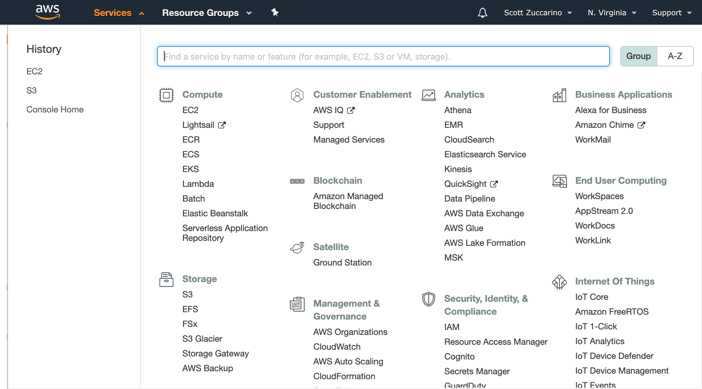
Similarly, AWS’s services tab includes a section for recently accessed services; this helps users easily access the subset of services that they’re using consistently. In the below menu, you can tell that I’ve recently interacted with Amazon’s S3 and Amazon’s EC2.

In part because AWS’s and Facebook’s organizations, userbases, and products are so large, they have chosen to optimize their navigation in this way. As time goes on, other organizations might follow.
Further reading:
- Adobe’s Beginner’s Guide to Information Architecture
- Toptal’s Guide to Information Architecture
- Information Architecture: What Is It and Where Did It Come From?
- Usability.gov’s Content Inventory